
 (Post by @ACollinsByrnes, 9 November 2012)
Here you have a map of the United States, with each county colored in either blue or red, depending on whether the majority vote in each was for Barack Obama or Mitt Romney, respectively (I don't know why Saguache County, Colorado isn't colored blue; other sources report Obama won in that county).
Just from looking at the map, it is deceivingly conclusive that Romney won the election, as most of the counties are colored red, but in reality, it was Obama who won.
How can that be? Find out after the break.
It's simple, really. Most of the areas colored red are sparsely populated. For instance, Loving County, in western Texas, as of the 2010 Census, has a total population of 82. That's not a typo. There are only eighty-two people living in that one county in Texas. When you consider the county's area of 677 square miles, you get an approximate population density of 0.12 people per square mile, or 8.26 square miles per person. In fact Loving is the least populous county in all of the United States. There are, as of the 2010 Census, 33 counties, each with a population of less than 1,000. Two-thirds of the counties on this list are in what I call the country's "center column," which consists of North and South Dakota, Nebraska, Kansas, Oklahoma, and Texas.
While it would be too exhausting to go county by county to give a running total for each candidate, there is another system which actually determines who eventually is elected to be the President. Of course, I'm referring to the Electoral College. The number of votes in the Electoral College (usually referred to as "electoral votes") is equal to the number of members of Congress to which each state is entitled. Currently, the total number of electors is 538; there are 435 Representatives, 100 senators, and 3 electors for the District of Columbia. A total of 270 electoral votes, equivalent to one-half of all electoral votes plus one, are needed to win.
 (Gage)
Here is a map showing how the electoral votes were distributed in the 2012 election. As you can see, much of the land area is still colored red for Romney, but look at the numbers associated with each state: 3 for each of the Dakotas, Montana, Wyoming, and Alaska; 4 for Idaho; 5 each for Nebraska and West Virginia; and 6 each for Utah, Kansas, Arkansas, and Mississippi. These 12 "red" states combined have fewer electoral votes than one "blue" state: California. Add in Oklahoma, Louisiana, and Kentucky, and you now have an equal number of electoral votes as New York, Florida, and Ohio combined. In fact, Romney won only 7 states which have more than 10 electoral votes each (Texas, Georgia, North Carolina, Arizona, Indiana, Tennessee, and Missouri) to gain 112 electoral votes. Three states Obama won have more total electoral votes than those seven: California, New York, and Florida, 113 electoral votes.
Why does a "small state" like Maryland have more than thrice the electoral votes as the much larger state of Montana? Simple: Maryland is more heavily populated.
Think of all the big cities in those states with more than 15 electoral votes: New York City, Philadelphia, Pittsburgh, Cleveland, Detroit, Chicago, Atlanta, Miami, Tampa, San Francisco, Los Angeles, San Diego, Houston, Dallas, and so forth. There are millions of people living in each of those cities, and in the surrounding areas. The same can't be said about those huge western states that only have 3 to 5 electoral votes, or even Alaska, which contains some of the most sparsely populated areas in the whole country.
One of the comments to the tweet above demonstrates the fallacy of these geographically-based maps:
@acollinsbyrnes So glad you put this on here. More square miles love Romney more than Obama!
— jamice bugeyes (@jamicebugeyes) November 10, 2012
To repeat and emphasize what @jamicebugeyes said, "more square miles love Romney more than Obama."
To put it bluntly, square miles don't cast votes, people do. What we need to do is show the significance of the contribution of each state and county to the election. How do we do that? By letting a statistic other than land area determine the size each county or state.
Enter the cartogram. A cartogram is a diagram where some thematic variable – in our case, population or electoral votes – is substituted for land area. The geometry of the diagram is distorted in order to convey this alternate variable.
 (ChrisnHouston)
Here is an abstract cartogram showing how the voting went. Each square on the diagram represents one electoral vote. Notice how the big western states have all shrunk significantly. You can see here that there is much more blue on this diagram than there is red.
 (This and remaining cartograms by Mark Newman)
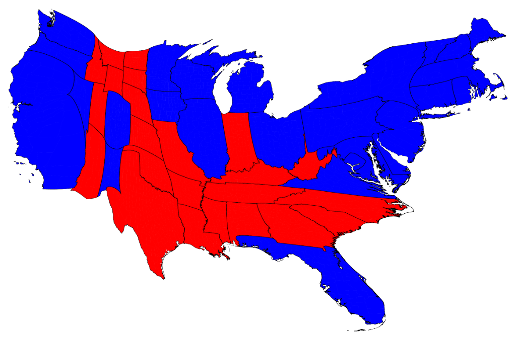
For those of you who don't like abstract cartograms, here's a more geographic representation of the lower 48 states, again with each state scaled according to electoral votes. Notice how huge the East Coast, the Midwest, and California are compared to the Center Column states and the Intermountain West. That whole section may have a lot of land, but not as many people.
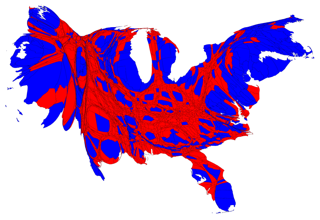
This disparity even more striking when we take a look at the results on the county level. Here's a cartogram where the individual counties are scaled according to population. Heavily populated metropolitan areas dominate the map, and many of them are colored blue. Major cities like New York, Washington, Miami, Chicago, Detroit, Los Angeles, and San Francisco are easily discernable. Many of the counties of the Center Column states are difficult to pinpoint, much less identify, as the area becomes a blur of black boundary lines and heavily deformed red counties.
Of course, at the moment we're considering only the winner of each county. In reality, many of the counties were almost evenly split between the two candidates.
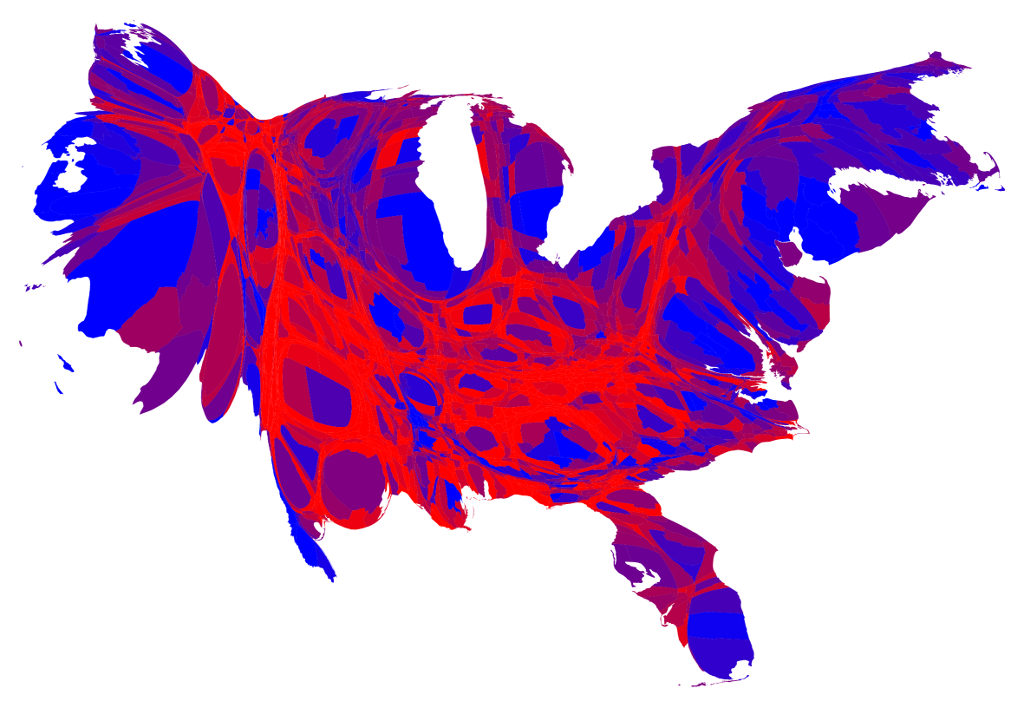
Here's a variation of the above cartogram, where if a candidate won 70% or more of the vote in a county, the county is colored blue or red. Those colored in a shade of purple have a narrower margin of victory. As you can see, there are a few pockets the country that voted strongly for the Democrat, but the strong Republican counties also appear to be the less populated ones, as there is much more blue and blueish purple on the map than there is red and reddish purple.

Finally, this variation takes the concept of a "Purple America" and visualizes it. There are some pure blue areas (e.g. Bronx County, New York), and some pure red areas (e.g. Uintah County, Utah; King County, Texas), but much of the country is a shade of purple.
In conclusion, when it comes to elections, a geographically-based map usually doesn't tell the whole story.
As an aside, it might be fun to see what elements of urban lifestyle can be used to compare the populations of those small counties. For instance, the entire population of Loving County, Texas could be transported on a 40-foot-long bus, though most of the county would be standing.


No comments :
Post a Comment